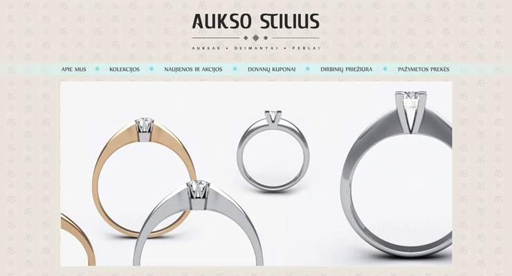
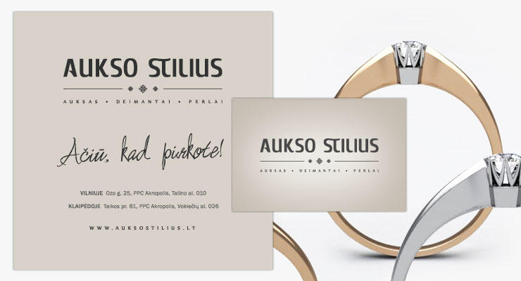
The main objective of the project was to carry forward the message of ellegance. The work was done for the eye of a goldsmith. We moulded and polished the curves of the logo to shere perfection. We played with subtle shades of the brand colour. The Style of Gold. This is what the name stands for. Truly, my prrrecious…
Website
cms, shopping cart, product management
Branding/Print
logo, wallpaper, stationary, promotionals